Skip to content
  • Home
  • Contact Me
  • Archives

Shawn Tech Place

IT Tech Online App Software Web Tips

  • Design
  • Entertainment
  • Mac
  • Management
  • Multimedia
  • Portable
  • Security
  • Technology
  • Tips ‘n’ Tricks
  • Web
  • Windows
  • Youtube
  • ShawnLivDotCom

The Top Ten Worst logos

     Posted in Design

I found this in Genplace, Here is my comments

This is a building hit the Sun but endup it look like …..


Dont understand the symbol at all. What is the connection with surgery

A-STYLE FASHION BUT LOOK LIKE THAT THINGS AGAIN
Hotdog ad become blowjob ad…haha…..
Is this going to be the logo of Olympic, I dont think so
Same thing again, it look like…………
The children crying…??? Need to improve on drawing
At least make it more cuties
This K Logo, i dont think is suitable for pharmacy
KIDS EXCHANGE OR KID SEX CHANGE??
SPACING ALSO DONT KNOW???
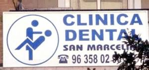
Is this really a Dental ad or something else???
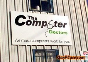
WHY THE MOUSE LOOK LIKE…….
Author:
Tagged Art & Design, design, logo, symbol, Worst Logo

Post navigation

My Uploaded video in Youtube < Stephen Chow Robbed the Bank> →
← New Wedding Invitation (Creative!!)

Email Updates

Enter your email address:

AD


Categories

  • Apps
  • Design
  • E-Commerce
  • Entertainment
  • Mac
  • Management
  • Multimedia
  • Portable
  • Security
  • Technology
  • Tips 'n' Tricks
  • Web
  • Windows

Copyright © 2026 Shawn Tech Place

Design by ThemesDNA.com


Notice: ob_end_flush(): failed to send buffer of zlib output compression (0) in /home/shawnpla/public_html/wp-includes/functions.php on line 5481