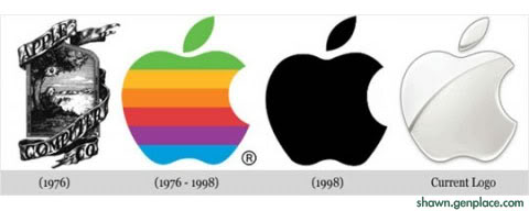
The Evolution of Mac Logo from 1976 until now

The most impressive logo of mac should be 1976 (a apple tree), but it is too complicated. In my opinion, logo should be simple and nice, just like current logo
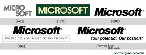
The Evolution of Mircosoft Logo from 1975 until now

Basically, Microsoft Logo has no much change since 1987 . The only main different would be in 1975 with green color in-box as well as the separation words of Mirco and soft
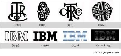
The Evolution of IBM Logo from 1888 until now

IBM logo has keep changing their logo to simple and neat. I have no clue of logo in 1891, it seen more like a tattoo rather than a logo.
For your information, previously IBM named as International Time Recording Company for mechanical time recorders